
KNIGHT SAWMILL
Brand Identity Presentation
THE LOGO CONCEPT:
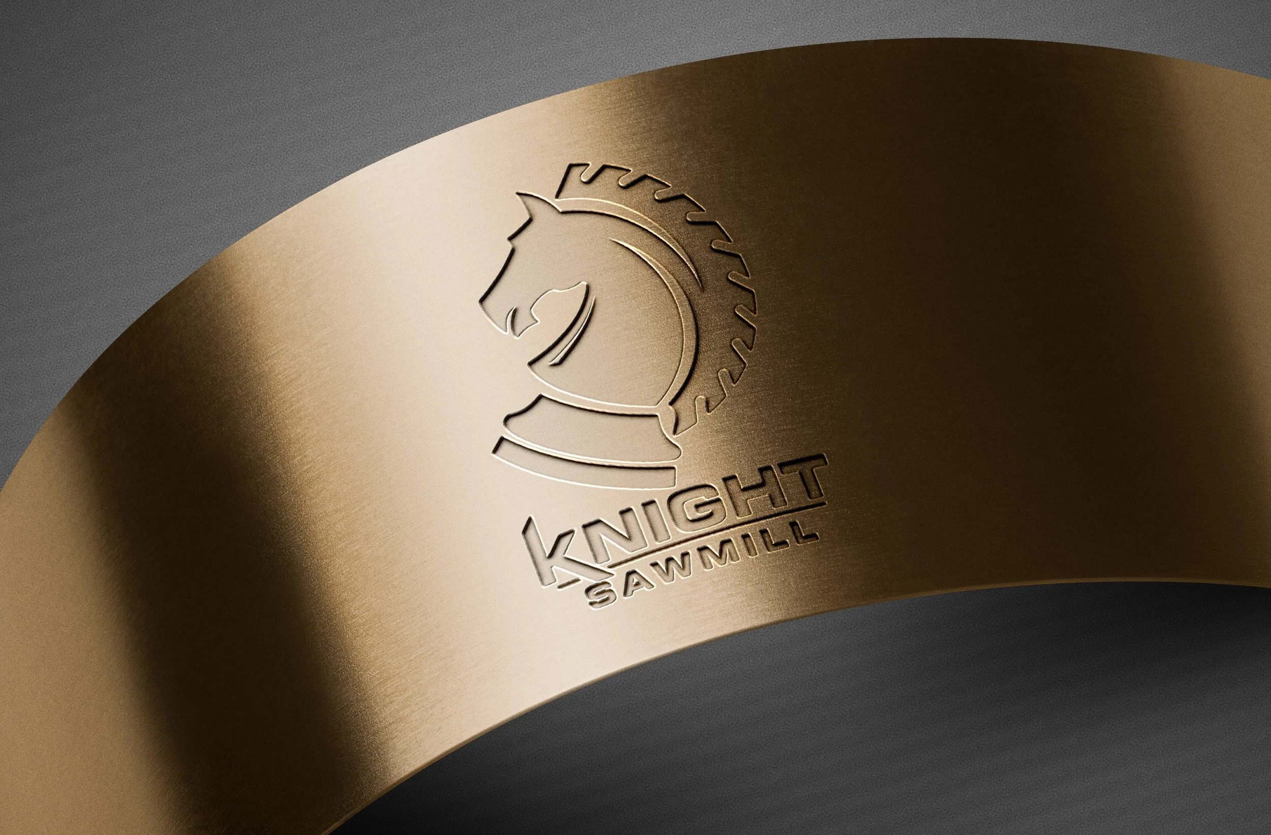
Knight Sawmill required a brand identity that reflected the quality of its craftsmanship while standing apart from the generic trees, logs, and saw blades commonly found throughout the lumber industry. I created a knight chess piece meets a circular saw blade. One represents strategy and strength. The other represents craftsmanship and precision. Together they become Knight Sawmill.
1. The Symbol
A Logo That Tells the Story
The strength of the Knight Sawmill logo comes from its simplicity. Two recognizable symbols merge together to create one memorable mark.
The Knight Chess Piece
The knight represents the qualities customers expect from a trusted craftsman.
Strength
Integrity
Reliability
Experience
Strategic Thinking
Unlike many chess pieces, the knight moves differently than every other piece on the board. It symbolizes finding better solutions through skill, planning, and expertise ~ qualities that define exceptional craftsmanship.
The Circular Saw Blade
The saw blade immediately connects the logo to the woodworking industry.
It represents:
Precision
Production
Craftsmanship
Efficiency
Transformation
Its circular shape also introduces movement and energy, reinforcing the continual process of turning rough lumber into refined products.
Combined Meaning
Together, the knight and saw blade become something neither could achieve alone.
The saw blade naturally forms the knight's flowing mane, creating a seamless symbol that is instantly recognizable while remaining unique within the industry.
The result is a mark that represents both the intelligence behind the work and the craftsmanship that brings it to life.
2. THE BRAND STORY
From Rough to Refined
The company tagline is more than a slogan ~ it describes the entire identity.

Every project begins as raw material.
Through experience, precision, and attention to detail, those materials become finished products built to last.
That same philosophy guided the creation of the logo itself: transforming simple geometric forms into a refined, memorable brand mark.
The identity reflects the same process Knight Sawmill performs every day.
3. DESIGN PRINCIPLES
Built for Every Application
A great logo must perform just as well on a business card as it does on the side of a truck.
The Knight Sawmill identity was designed with versatility in mind.
Strong Silhouette
The bold outline remains recognizable even at small sizes.
Single Color Reproduction
The logo maintains its integrity in one color, making it ideal for:
Laser engraving
Wood burning
Vinyl cutting
CNC routing
Embroidery
Screen printing
Metal fabrication
Instant Recognition
The combination of the knight and saw blade creates an icon that customers remember after seeing it only once.
Timeless Design
Rather than following current design trends, the logo relies on clean geometry and simple forms that will remain effective for years to come.
4. TYPOGRAPHY
Strength Through Simplicity
The typography was selected to complement the bold icon without competing for attention.
Primary Typeface
A modern geometric sans-serif communicates:
Confidence
Durability
Professionalism
Precision
The heavy weight reinforces the company's reputation for dependable craftsmanship while maintaining excellent readability across print and digital applications.
Supporting Script
The handwritten tagline introduces a subtle human element.
It represents the pride, care, and craftsmanship that goes into every finished project.
Together, the bold typography and handwritten signature balance industrial strength with personal attention to detail.

5. COLOR PALETTE
Crafted to Fit Every Environment
The Knight Sawmill identity was intentionally designed to work across a variety of materials and applications.


Heritage Gold
Inspired by quality craftsmanship and traditional woodworking. Adds warmth while communicating excellence and premium service.
Rich Walnut
Reflects natural hardwoods and reinforces the company's connection to the lumber industry.
Slate Gray
Modern, durable, and professional. Ideal for equipment branding, vehicles, and industrial applications.
Black
Powerful, timeless, and highly versatile. Ideal for signage, apparel, decals, and branded merchandise.
White
Clean and highly legible on darker surfaces while maintaining maximum contrast.
Mixed Color Combinations
The identity was developed to maintain consistency regardless of color combination or background.
Whether reproduced in black, white, gold, brown, or gray, the logo remains instantly recognizable.
LOGO ANIMATION
Bringing the Brand to Life
The Knight Sawmill identity extends beyond print into motion.
Animated logo treatments provide a polished introduction for videos, presentations, advertisements, and social media content while maintaining the same clean visual identity established by the static mark.